As the holiday season approaches, many of us want our homes to exude warmth and comfort without the overwhelming visual clutter that often comes with traditional holiday décor. By choosing unexpected neutral colors, you can transform your living room into a calming oasis before the festivities begin. These unique neutrals go beyond the standard beige and gray, bringing subtle depth and sophistication to your space. Here are some refreshing neutral hues to try for a serene pre-holiday ambiance.
1. Sage Green
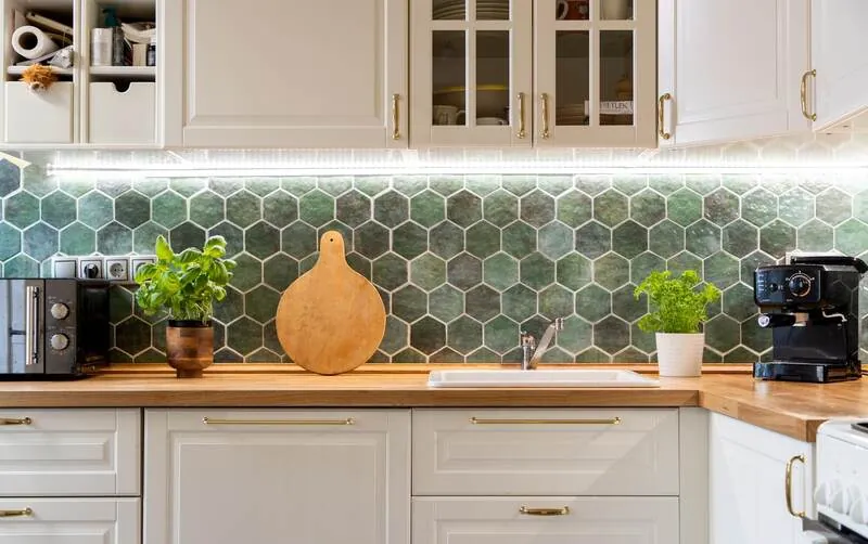
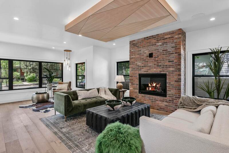
Sage is a calming, earthy green that brings a hint of color while staying in the neutral family. This soft, muted shade works well as an accent wall or on large pieces like sofas or armchairs. Paired with warm wood tones and natural textures like rattan or linen, sage green can create a cozy and sophisticated look that evokes a natural winter wonderland.
2. Warm Taupe
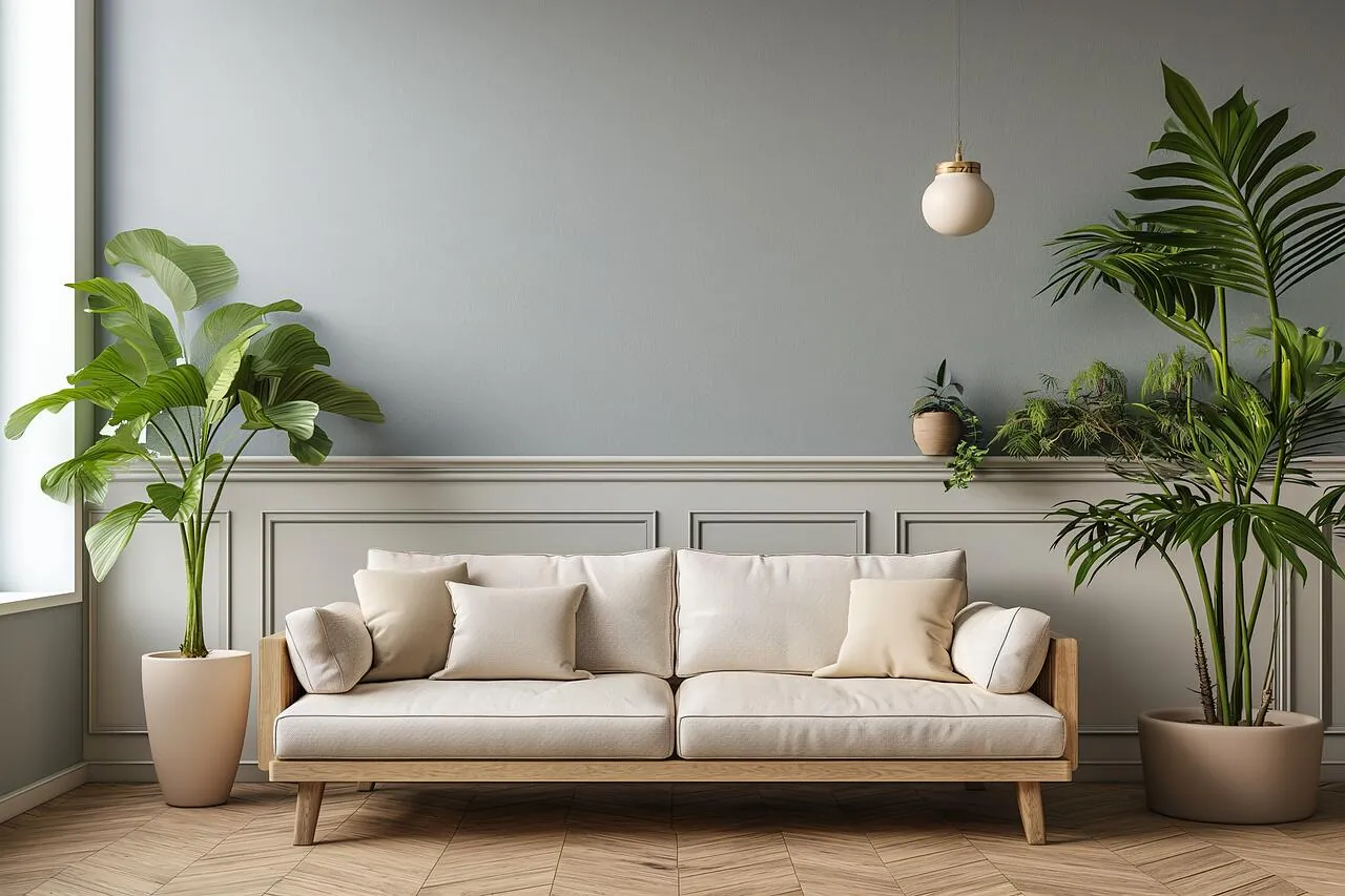
For a more unexpected take on neutral, consider warm taupe. This hue combines the coolness of gray with the warmth of brown, creating a versatile tone that feels inviting yet refined. Warm taupe works well on walls or in upholstery, creating a rich backdrop that enhances natural and artificial lighting. Adding taupe accents in throw blankets or pillows can soften the room, creating a harmonious space that’s perfect for winding down.
3. Greige (Gray-Beige)
Greige, a mix of gray and beige, offers the best of both worlds. It’s adaptable to nearly any color scheme, making it an excellent choice for anyone who wants a subtle yet modern base. This shade allows you to play with seasonal accents in darker, richer tones for a cozy holiday feel. Use greige in wall paint or large rugs to balance cooler and warmer elements in the room.
4. Dusty Rose
While not a traditional neutral, dusty rose brings a soft, sophisticated feel to a room without being overly bold. This gentle blush hue is warm enough to feel inviting and unique enough to add personality. Pair it with soft whites, creams, or muted greens to maintain a neutral palette while introducing a sense of warmth and elegance. Dusty rose accents like throw pillows or vases can add just the right amount of color without overwhelming the room.
5. Charcoal Gray
Charcoal gray adds depth and drama to your living room while still functioning as a neutral. This darker shade brings out contrast, perfect for creating a cozy, intimate atmosphere without feeling too bold or heavy. Pair charcoal gray with lighter accents in white, cream, or soft pastels to balance the look. Charcoal gray works especially well on accent walls, cabinetry, or large furniture pieces for a sophisticated, serene vibe.
6. Soft Camel
Soft camel is a cozy, natural hue that complements nearly every neutral tone. With its subtle warmth, camel adds a hint of earthy richness, which is ideal for a comfortable, lived-in feel. It pairs well with cream, white, and darker neutrals like charcoal or brown. Try a camel-colored sofa or armchair to ground the room, and layer with textured accents like woven baskets or faux-fur throws for a luxurious look.
7. Pale Lavender
For an unexpected twist, try a hint of pale lavender. This soft, cool color is more versatile than it seems, offering a calming effect without overwhelming the senses. Pale lavender works beautifully with other neutrals like gray and cream, creating a gentle, cohesive look. Add lavender accents through throw pillows or art pieces, and complement with silver or glass décor for a soft, shimmering touch.
8. Mocha
Mocha is a rich, deep brown that creates a cozy, grounded feeling. This color can add elegance and warmth to your living room, making it feel more intimate without sacrificing a neutral palette. Use mocha on accent walls or in smaller pieces like ottomans or throw blankets. Mocha’s depth works well alongside lighter neutrals, giving your living room a sophisticated feel that’s both modern and timeless.
Tips for Balancing Neutrals
Once you’ve chosen your unexpected neutral colors, here are some tips for pulling it all together:
Layer Textures: To keep the room visually interesting, layer different textures such as velvet, linen, and faux fur. This adds dimension to the space and enhances the cozy, welcoming vibe.
Incorporate Natural Elements: Wood, stone, and natural fibers blend beautifully with neutral tones, creating an organic feel that complements the pre-holiday mood.
Keep Lighting Soft: Opt for soft, warm lighting to enhance the calming nature of the room. Table lamps, wall sconces, and candles can all add warmth without overpowering the space.
Add Pops of Seasonal Accents: Even with a neutral base, you can easily add in seasonal accents, like dried florals, pinecones, or subtle metallics, for a festive touch that feels natural and relaxed.
These unexpected neutrals can help create a calm, stylish foundation for your living room, allowing you to enjoy the pre-holiday season with a space that feels both fresh and timeless.